branding
Danang
A destination brand celebrating the coastline and culture of Da Nang.


Branding, Art Direction, Illustration



This project set out to capture the energy of Da Nang — its beaches, mountains, and street life — in a single cohesive identity for a local tourism initiative. Rather than default to postcard imagery, we spent time researching the city's actual rhythm: the morning markets, the neon-lit riverside, the mix of old and new architecture. That research directly shaped every visual decision that followed, from color to typography to iconography.
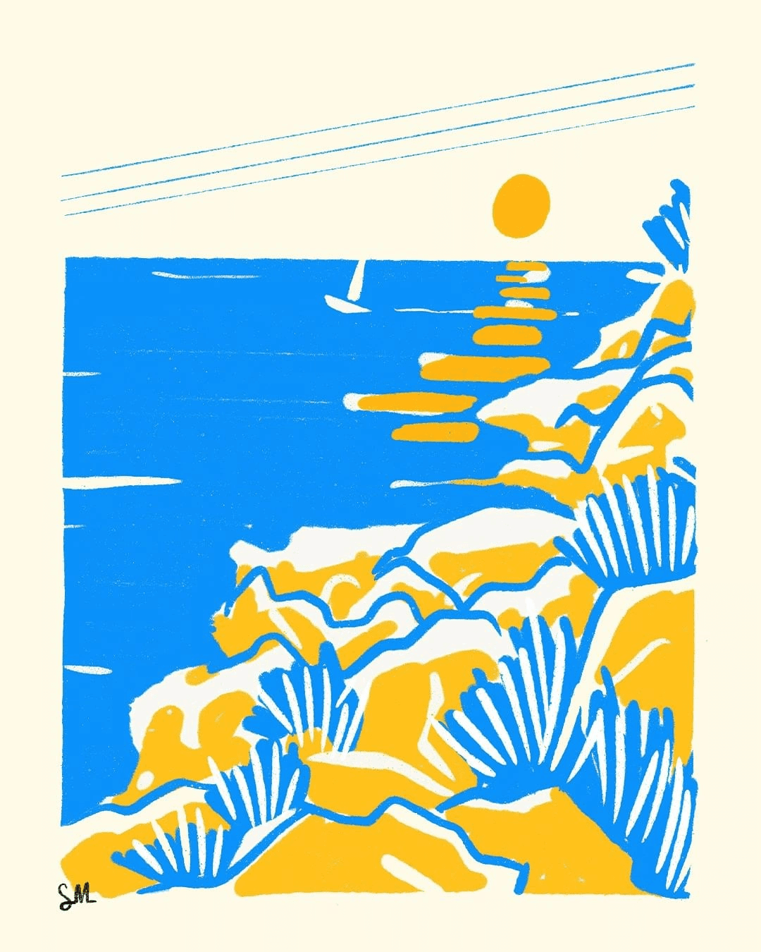
The color palette pulls from golden hour skies and ocean blues, while custom illustrations reference the city's landmarks in a modern, graphic style rather than literal photography. We built a flexible illustration system so new landmarks or seasonal campaigns could be added without hiring an illustrator each time. This kept the identity sustainable for a small in-house marketing team to maintain long-term.

Typography leans playful but confident, echoing the city's mix of laid-back coastal charm and fast-paced growth, and it was chosen specifically to read well in both Vietnamese and English. We paired a rounded display face for headlines with a highly legible sans-serif for body copy, ensuring the system worked equally well on billboards and mobile screens. Careful attention was paid to how the type handled diacritical marks, which is often overlooked in bilingual branding work.

The identity now lives across signage, digital campaigns, and merchandise, giving the city a consistent voice across every touchpoint a visitor might encounter. Local partners — hotels, tour operators, and cafes — were given a simplified toolkit so they could apply the brand without needing design support each time. Early feedback suggests the campaign has meaningfully increased recognition of the city's tourism brand among younger travelers.


