branding
Flowers
A soft, botanical identity for an independent flower studio.


Brand Identity, Packaging



Flowers needed an identity as delicate as the arrangements it sells, without tipping into cliché — a real risk in an industry saturated with soft pinks and cursive scripts. We built the brand around hand-drawn botanical linework and a muted pastel palette instead, aiming for something that felt considered rather than decorative. The goal was a system that would still feel fresh after years of use, not just at launch.

The logotype uses a custom ligature between two letters, echoing the way stems intertwine in a bouquet, a detail that took several rounds of hand-lettering to get right. We avoided an overly ornate script in favor of something cleaner, so the mark would still read clearly at small sizes on packaging and social profiles. The botanical linework used throughout the system was drawn specifically for this project rather than sourced from a stock library.
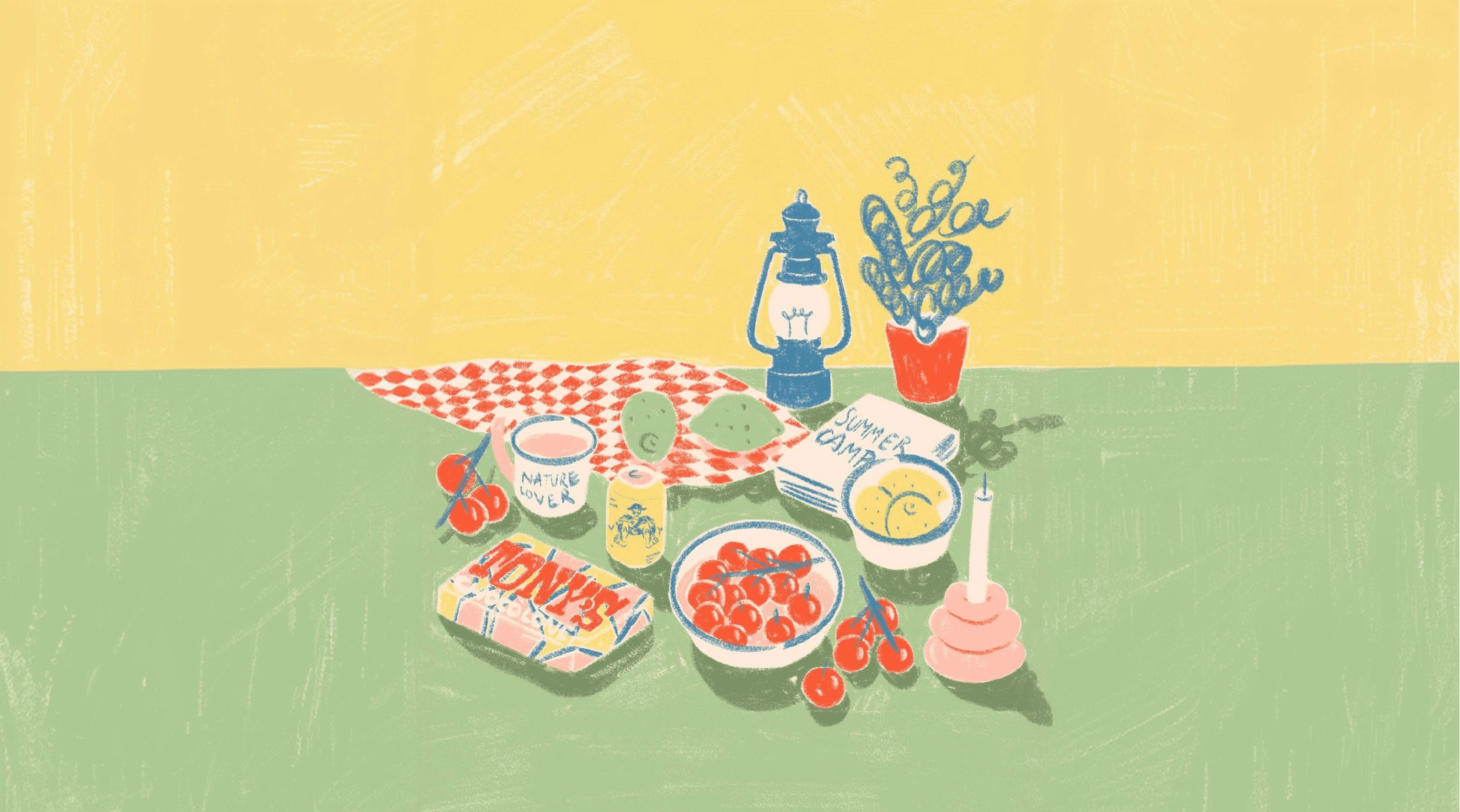
Packaging was designed to be reused — simple kraft wrapping with a single ink color, keeping cost low and sustainability high, which mattered to the founder as much as the aesthetic did. We tested several paper stocks before settling on one that held ink cleanly without adding unnecessary production cost. The wrapping was also designed so customers could repurpose it, extending the brand experience past the point of purchase.

The identity has since expanded into seasonal campaign material, each one built on the same restrained visual system so the brand never feels like it's chasing trends. Holiday and event campaigns simply adjust the color accents while keeping the core typography and illustration style intact. This consistency has made the brand easy to recognize across a growing number of touchpoints.


